Recycling is confusing, boring, and hard to track.
Sortly started as a personal project to explore habit-based design. I went in assuming the problem was decision fatigue; people just didn't want one more small daily choice. My research proved otherwise. The real barriers were a lack of knowledge and a lack of feedback: people weren't confident about what goes where, and had no way to see whether their efforts were making any difference.
Interviews, surveys, and a lesson in research logistics.
I conducted three interviews and distributed an anonymous survey to participants beyond just Michigan students. The survey used visuals of common household objects to test actual recycling knowledge without prompting; the goal was to surface real gaps rather than self-reported behavior.
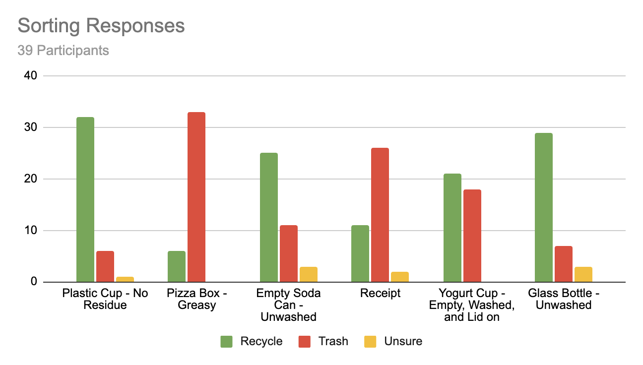
Most people understood the basics but made errors under time pressure; knowledge gaps often correlated with educational background. I also attempted a diary study where participants tracked their sorting confidence over a couple of days, but only one person completed it. Lesson learned: longitudinal studies need reminders, compensation, or a controlled setting to work.
From the research I built a user persona and journey map. The pain points were consistent across participants: uncertainty about sorting rules, no visibility into personal impact, and recycling feeling like effort without reward.
Mapping the app structure.
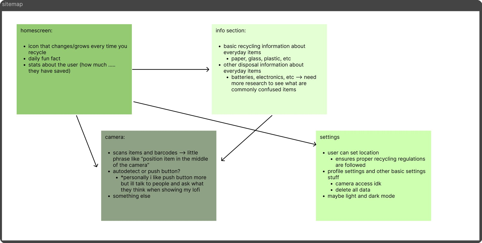
Before moving into visual design I mapped out the full sitemap: a home screen with impact stats and daily fact, a camera scanner, an info section covering common disposal questions, and a settings screen. The info screen was eventually cut after user walkthroughs showed it added friction without adding enough value.
Lo-fi sketches to Figma wireframes.
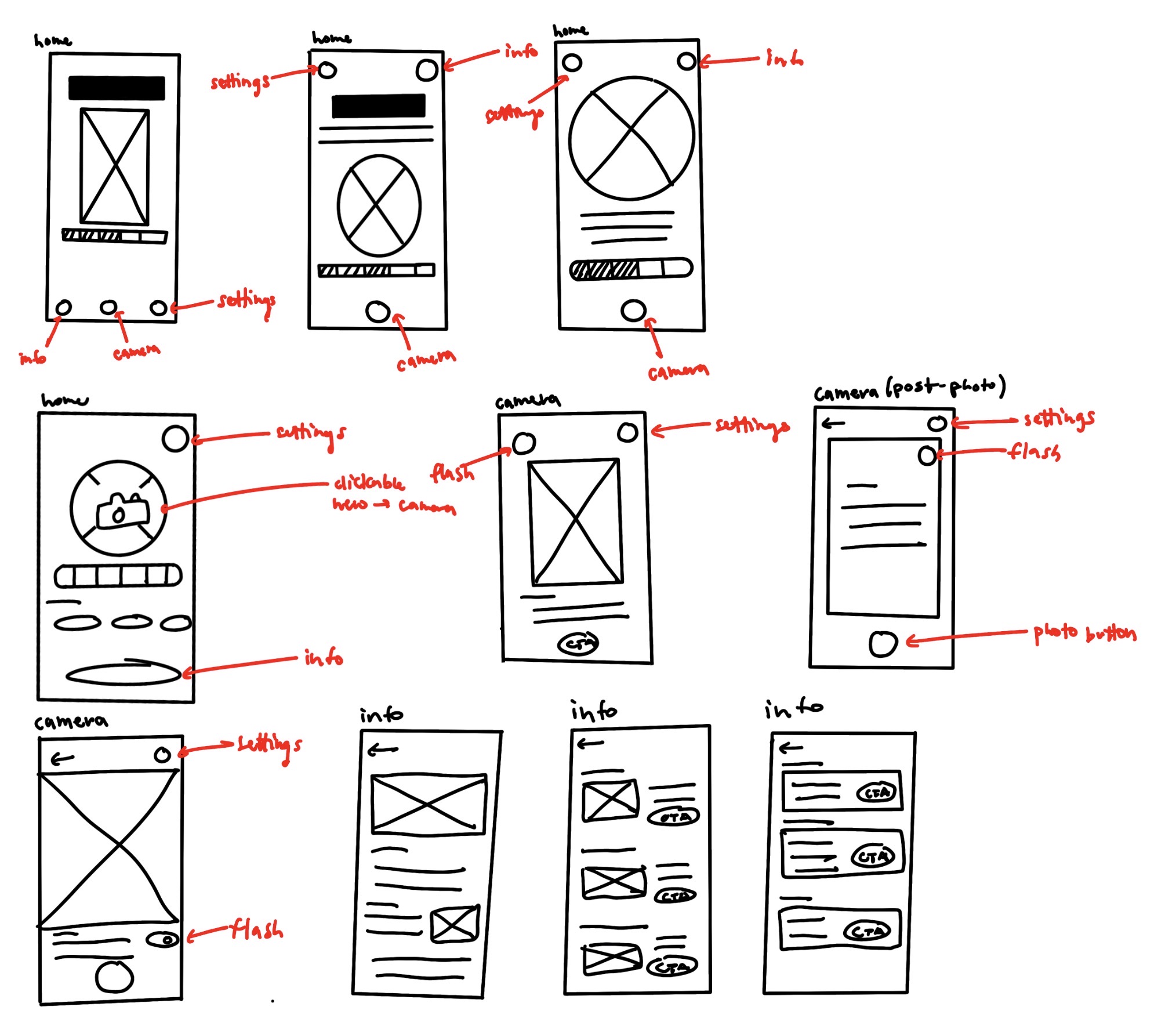
The process started with hand sketches, then moved into Figma lo-fi wireframes. I ran walkthroughs at each stage to catch friction points early; an info screen I'd planned got cut entirely after users found it unnecessary.

Building the visual language.
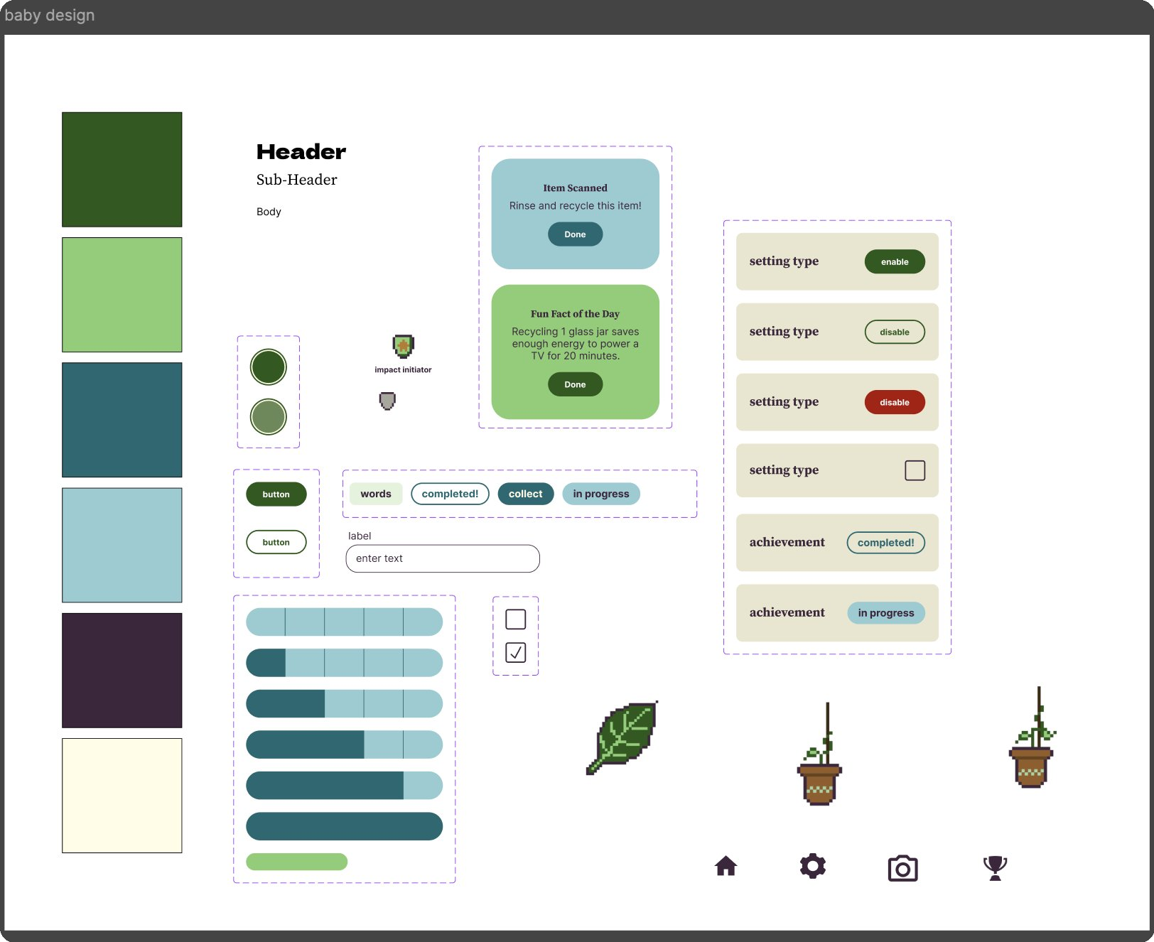
The visual language is earthy and approachable: greens for growth, warm neutrals throughout, and a pixel-art plant mascot that levels up as you log more scans. All of the pixel art — including the plant growth stages and the achievement badges — was made by me. The goal was gamification that motivates without feeling manipulative; every component was designed to reinforce habit-building rather than just drive engagement.
The full app flow.
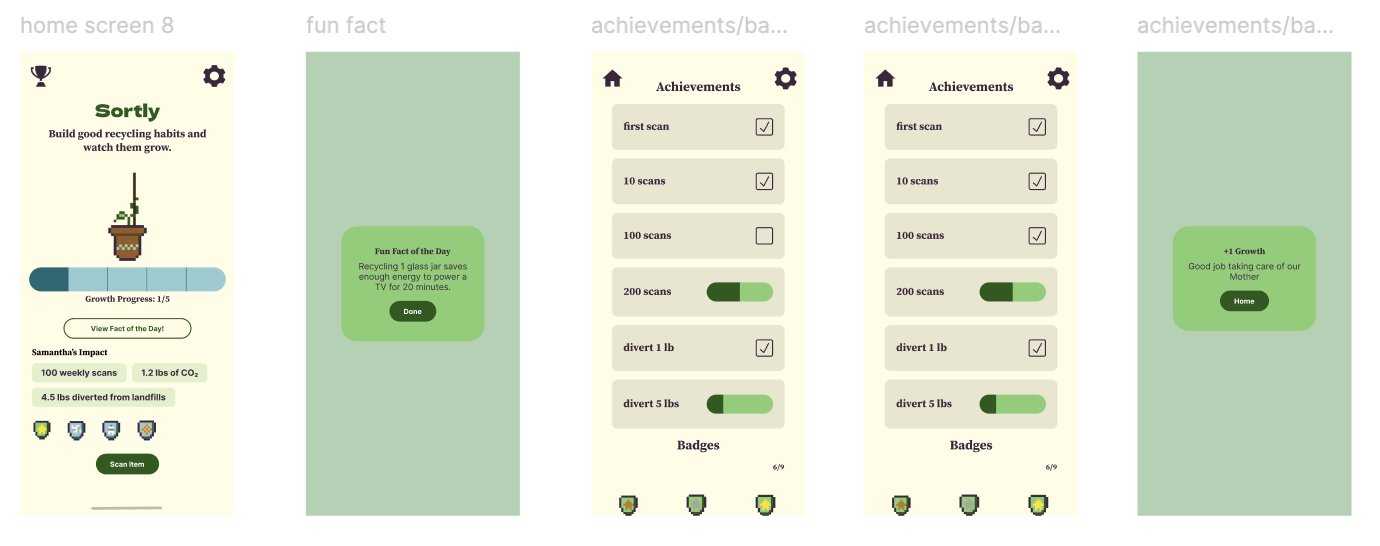
The final screens cover the complete flow: home with a growth tracker and weekly impact stats, a barcode scanner, a fun fact modal, achievements and badges, and settings with a full dark mode variant.
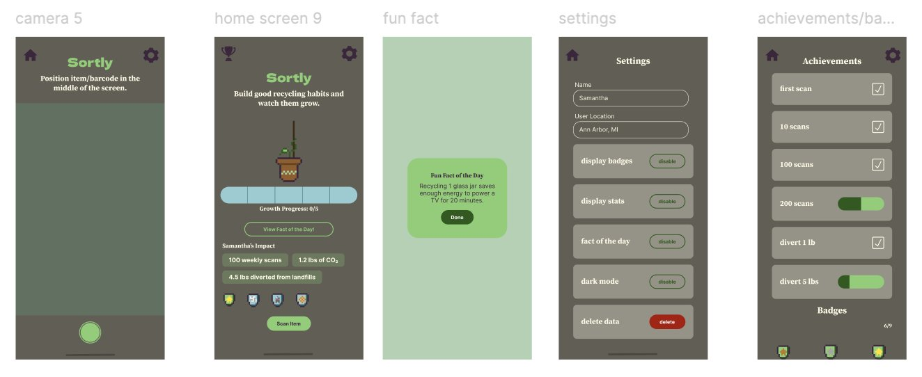
The settings screen lets users toggle every feature and delete their data entirely. There's a meaningful difference between gamification that builds habits and gamification that traps you; I wanted Sortly clearly on the right side of that line.